In my spare time (that’s a joke), I am writing a book about faculty members’ experiences and practices online. The focus is social media and online social networks, and the book draws on our research on networked participatory scholarship. I was really excited yesterday to see the Chronicle of Higher Education publish a story largely focusing on the tensions surrounding social media use in academia (chapter 3 in my book). And a couple of weeks ago, Kristen Esheleman wrote about the value of networked research for digital learning at Inside Higher Ed.
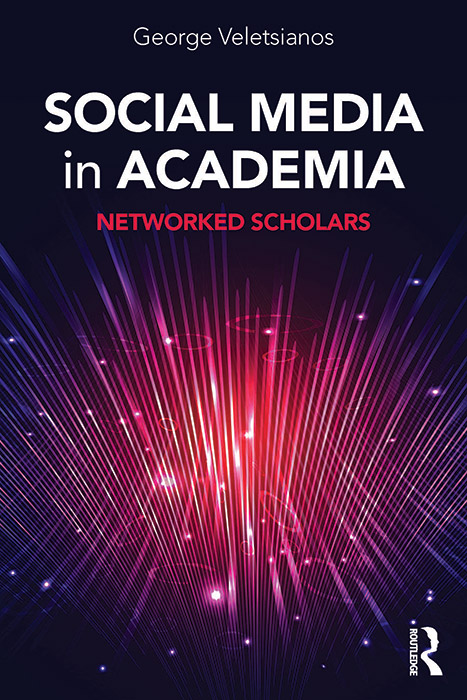
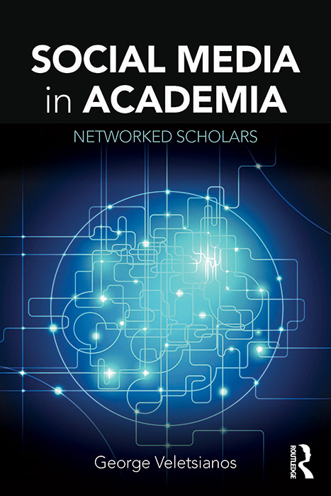
More exciting though,. today, I received four covers to choose from, and I thought I’d share them here. I have a favorite, but I’d love your input, too! Which one (1, 2, 3, or 4) would you choose? Why?

Renato P. dos Santos
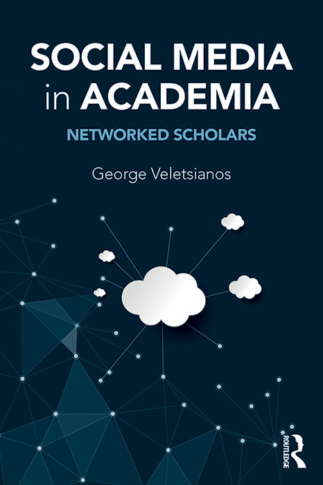
The fourth one I find a little simplistic and démodé even if includes the cloud. The first one is nice but it is not clear to me the relation with the subject of the book. Between the second and the third, I go with the second as I see more strongly the connection with the subject of the book.
Rose Matthews
#3 because it’s dynamic – gives a sense of travelling forward. (#1 is great too – explosive & hot, but little sense of connection.)
Federico Ferrero
Looking forward to reading the book!
Federico
Don Gorges
Thanks for asking, George. I should’ve read the reference material you have collected for insights, however, my instinctive response is that none of these 4 visuals offer a meaningful conceptual-metaphorical connection to the topic of “scholars’ participation in online social networks to share, reflect upon, critique, improve, validate, and otherwise develop their scholarship” – although #4 has elements of graphic relevance.
Michael Barbour
I like number 2.
Chuck Hodges
my vote is number 4 (the one at the bottom). I see the graphs in it, which remind me of social network analysis and I like the cloud since all this lives in the cloud. The others have more of an information technology feel to them, in my opinion.
Mohsen Saadatmand
I would go for #2. A harmonic design of colors and text. It is also dynamic which shows connections and networking in a more abstract way.
My 2nd choice is #4 which shows some kinds of clouds and nodes but it looks to me a bit of a static design!
Pat Harpur
Like last one. Hints at haphazard connections which are more rhinitis than linear. Also takes Me to ‘sputnik’ spaces for educators: new, scary vistas and ‘roads’ far less travelled.
Pat Harpur
Like last one. Hints at haphazard connections which are more rhizomatic than linear. Also takes Me to ‘sputnik’ spaces for educators: new, scary vistas and ‘roads’ far less travelled.
Kate Whittaker
I like numbers 4 & 1. 4 because it has clouds and speaks to networking in the Cloud but also because it evokes spaciousness and links to graphs so nebulous, floaty connections become firmer and more ‘framed’ by engagement and experience over time, through space. 1 because it is a witty, dynamic play on the 0/1 behind tech but also because it captures the multi-dimensional nature of these kinds of networks.
Pani
you rock my friend, love #2