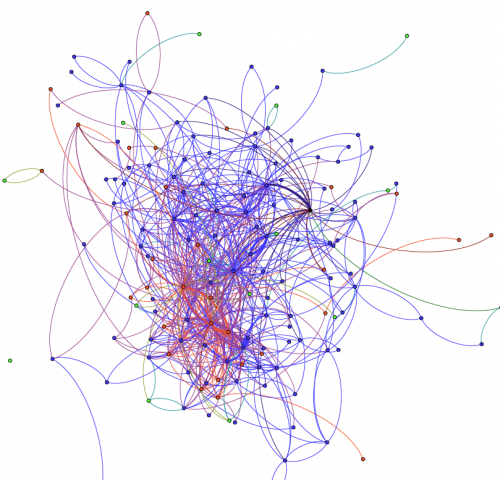
As part of my research on digital scholarship and the experiences/practices of scholars in online networks, I am working with the Texas Advanced Computing Center and the newly-established Visualization Lab at the College of Education to understand learner and scholar participation patterns on the social web. Below is our first visualization, which shows interactions between three types of users who are contributing to a hashtag (red, blue, green). It’s a directed graph, with nodes representing users, and edges representing interactions between users. The thickness of the edge represents # of interactions (thick = more interactions). When nodes of a different color interact with each other, the edges take the color of the two node (e.g., when a blue node interacts with a red node, the edge is purple). What does this visualization tell us? 
We are still trying to make sense of this, and we are slowly learning from the tutorials that Tony Hirst has created. This is what (i think) this says: First of all, we know that the majority of the people contributing to this hashtag are not having a conversation with each other (#nodes making up the dataset are 3 times the group shown above – this is not shown on the graph). Second, it looks likes there’s a few “central” folk through which conversations occur. Finally, even though interactions happen between red and blue nodes, it looks like the majority of the interaction is happening within those two groups. And that’s important in this situation because one of our hypothesis was that the red group was joining this community to interact with the blue group (if that was the case, we would be seeing more purple in the image above). We definitely need additional ways to evaluate some of these statements, but that’s what it “looks like” from the image above. And here’s where I think data visualizations start becoming really valuable: You can quickly see patterns and ask questions, and continue from there. We have some ideas and hypotheses, but we also want to let the data bring up phenomena that we haven’t thought about. I don’t yet feel confident that I fully understand what I am seeing here, but I am quickly learning a lot! So my question to you is: how would you interpret this? What questions do you have of what you are seeing here?

Michael M Grant
George, I would actually like to see it visualized a little differently. I would like to see something that maybe shows circles, where the larger the circle the farther the reach to others. Overlaps could represent social connections.
It may also be helpful to see this representation in 3D, so I can rotate it and see it from multiple sides. It may also be helpful to focus on the two places, I think, that have the thickest and darkest activity– one in red and one in blue– to see what topics and connections these represent.
I also wondered what the placement in the depth and space represents. Is there a timeline or orientation to how the data are being represented? The ones that are farther away– are these later in time or farther away from social networks?
Just a bunch of ideas for me to think about here, George.
Sally
How are you coding individual interactions? Are they Tweets using the same #, or by tweets directed at another user@ AND hash tag? I wonder if frequent interactants drop the # and just use the @ to direct their tweets to each other. Can you visualize content, plus @, plus #?
Interesting – I like the attempt to visually represent the dimensions of what is essentially a bunch of simultaneous linear interactions.
George Veletsianos
Thank you for your comments, Michael! Those are great next steps, especially in focusing on the high-activity nodes and understanding who those individuals are and what that activity represents. As a researcher whose work is predominantly within the qualitative realm, I’m excited to go behind the scenes and examine the interesting “places” that this graph highlights.
George Veletsianos
Sally, thank you for your questions. These are all tweets using the same hashtag AND directed to specific individuals. This is because we want to look at the hashtag group, so in the case where the hashtag is drop in interactions between people, that interest ceases to be of interest.
Your question on whether we can visualize content is an interesting one because I have struggled with it. Do we reduce tweet content to some quantitative measure in order to visualize it? I think that might be helpful to add more insight to the graph, but I think that a qualitative analysis of the tweets is warranted here. For example, we can use the number of tweets from each person to expand the size of their node. But, we also need to understand what exactly it is that this community is discussing. This is what I did when I studied researchers’ and scholars’ twitter activity: https://www.veletsianos.com/2011/10/24/what-do-scholars-do-on-twitter/
Thank you again for your comments – much appreciated.
Chuck Hodges
I wonder if there is any merit in looking at the length (number of characters) of the tweet. You could weight the edges related to the length of the tweet. Of course, longer may not mean anything related to the conversation.
It gets away from the “visual” part, but I wonder what some standard matrix properties would mean for an adjacency matrix of this graph. For example, would the eigenvalues/eigenvectors mean anything in the context of the twitter conversation.
Just random ideas…
Ken Tothero
Nice George! You are definitely providing evidence for our contention that one of the primary purposes for data visualization is the generation of hypotheses.
Bodong Chen
Great work, George! I did some preliminary work similar to this a while ago, but didn’t get a chance to go deeper. See a presentation [in pdf] I did at #AERA2011: http://individual.utoronto.ca/bodongchen/file/Chen_AERA2011_Twitter_backchannel.pdf
A specific question I have is how did you group people in this analysis?
George Veletsianos
Hi Bodong,
Thank you for your comment and for sharing your paper. The individuals were grouped according to their role (e.g., student, faculty member).